In today’s economic space, it’s no secret that we all have to do more with less. This is a challenge in any area of business, but for designers and architects who are charged with creating the look, flow, and brand for an orthodontic practice, the challenge can sometimes be amplified.
Orthodontic Products recently spoke with a handful of industry designers and architects who shared their most recent projects, demonstrating how to make it all come together.
—
Practice Name: Damon Orthodontics South (Clay H. Damon, DDS, and Paul L. Damon, DDS)
Practice Location: Spokane, Wash
Square Footage: 2,100
Designed By: NAC|Architecture
Project Time Frame: Started in late 2010; completed in spring 2011.
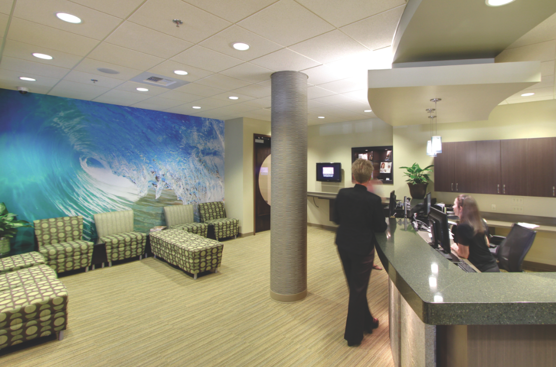
A large photographic mural in the waiting room, combined with warm sandy colors, convey the beach theme.
What the Doctor Wanted: Cousin orthodontists, Clay and Paul Damon, wanted to make a “splash” with the design of a new, shared satellite office on the south hill in Spokane, Wash. They wanted this small and efficient office to showcase their commitment to technology but be warm and inviting for patients. They loved the large expanse of glass in one corner of the suite and wanted to extend the feeling of views and light throughout the office.
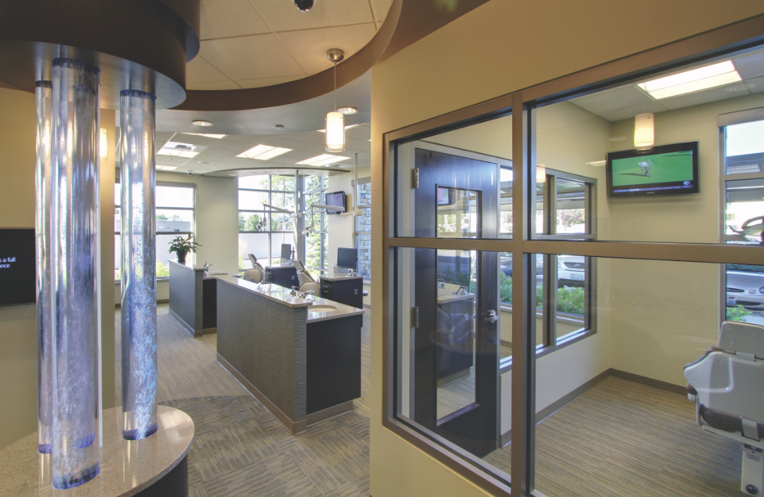
Utilizing the large expanse of glass in one corner of the suite, the office design extends the feeling of views and light throughout the office.
The Execution: Colors, textures, and patterns of beach and ocean were mixed in the interior. We duplicated the exterior window system at the interior of the suite, and arranged windows in walls so exterior views and light from the exterior flowed into other spaces without windows.
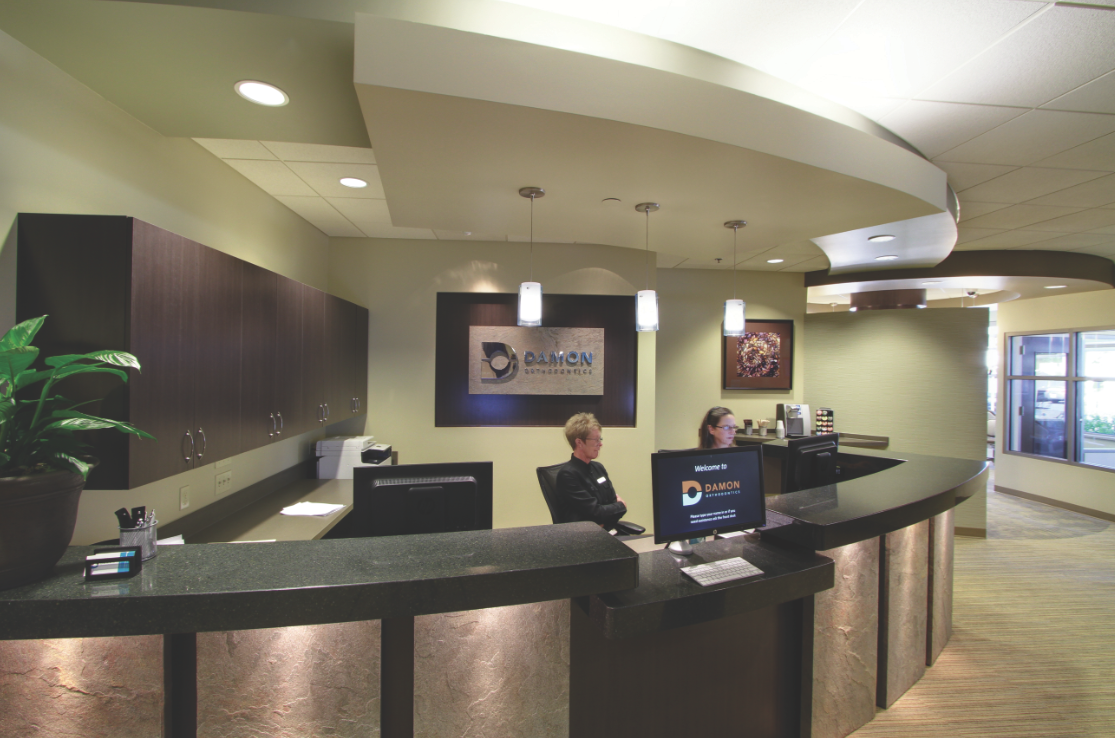
Design Inspirations: Sand and water. Going to the orthodontist should be a “day at the beach,” right? We caught the element of moving water in bubble columns at the brush area and a large photographic mural in the waiting room. Warm, sandy colors were a backdrop for the suite, with stone texture at the reception desk, rich wood color, and playful wall coverings that kicked up the interior vibe.
The practice owners wanted to showcase their commitment to technology but be warm and inviting for patients.
Design Challenges and Resolutions: Making a small space functional and avoiding chopping it up was a challenge. The suite entry is off of a building corridor, so it needed to have an initial impact. We achieved this through lighting, graphics, and converging forms, and a unique door pull that is a work of art.
Favorite Feature: The creative use of interior windows to bring daylight deep into the suite, while also adding a more spacious, visually stimulating feel to the entire office.
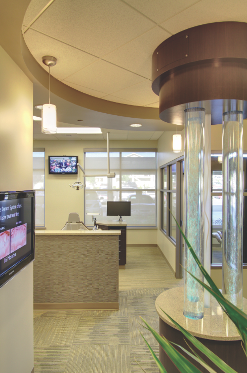
The element of moving water was captured in bubble columns placed at the brush area.